Diagnositic plot for homoscedasticity across variables
Details
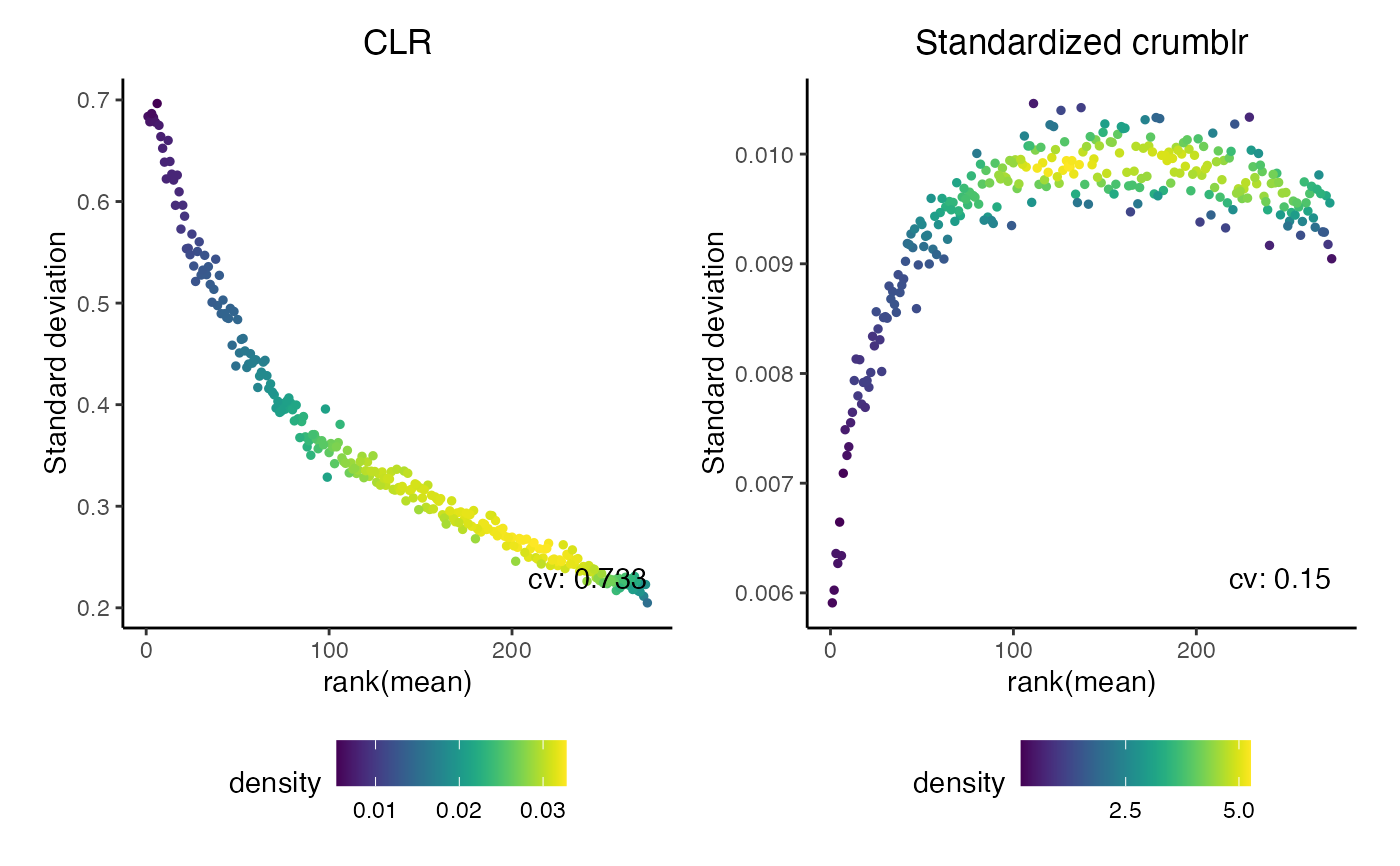
Plot the sd versus rank mean of each row like vsn::meanSdPlot. Also show the coefficient of variation of the variances. A lower value indicates stronger variance stabilization
Examples
# set probability of each category
prob <- runif(300)

# number of samples
n_samples <- 1000

# number of counts
nCounts <- 3000

# simulate counts from multinomial
counts <- t(rmultinom(n_samples, size = nCounts, prob = prob))
colnames(counts) <- paste0("cat_", 1:length(prob))
rownames(counts) <- paste0("sample_", 1:n_samples)

# keep categories with at least 5 counts in at least 10 samples
keep <- colSums(counts > 5) > 10

# run crumblr on counts
cobj <- crumblr(counts[, keep], max.ratio = 10)

# Plot for CLR
# For each sample, plot rank of mean vs sd
fig1 <- meanSdPlot(cobj$E) + ggtitle("CLR")

# run crumblr::standardize()
df_std <- standardize(cobj)

# Standardized crumblr
fig2 <- meanSdPlot(df_std) + ggtitle("Standardized crumblr")

# Standardizing the crumblr results better stabilizes
# the variances across variables
fig1 | fig2